29 September 2010

3D Kate


Created by AnOther Magazine with filmmaker Baillie Walsh, KM3D-1 stars Kate Moss in a bookend to Mr Walsh’s legendary holographic film for Alexander McQueen’s autumn/winter 2006 show.
With a performance that recalls the wuxia genre of movies (Wong Kar Wai would make good use of this technology!), KM3D-1 suspends Kate in time and space, caught inexorably in the parallax gap, a butterfly in a spider’s web. Captured at 1,000 frames per second – a speed so slow that movement is almost imperceptible – Kate’s sphinx face appears frozen (no, not the botox), transforming her into an impenetrable cypher. She is a modern Mona Lisa shattering her own self-image.
Made with state-of-the-art Phantom cameras, specially built for the project to create extreme slow motion and a dramatic 3D effect, KM3D-1 reflects AnOther Magazine’s raison d’etre: to champion creatives pushing the limits of what seems possible.

High Style

October's offerings.

26 September 2010

Spring 2011 Milan: Jil Sander

Now that minimalism is a firmly established theme at the Spring shows, Raf Simons shows us how to forward this idea with some perfectly wearable clothes that is inspiring with the clashing palette of neons, brights and primaries. Mr Simons is a colourist and he has experimented with such bold colours frequently, most recently, with the Jil Sander's mens collection last June. In fact, together with the floral prints, volumes and ease, this collection seemed a continuation of the same ideas, re-interpreted for women. (Prada did the same thing, I'm guessing for consistency and self-preservation?)
Lengths, if you care about such things, are emphatically long, with full shapes from classic haute couture. However, stripped of any embellishment, the effect is modern and casual looking. I love the plastic bag bags!

25 September 2010

Li Bingbing looking gorgeous in October's Bazaar China: Such a lovely cover I must say. Love the smoke masthead.

Weekend Reading List

Isn't it lovely to be in bed surrounded by books and papers on a Saturday night knowing that all the people one doesn't like are frantically out there doing whatever hectic things they do that make thier lives meaningful? I'm talking about those Formula One things of course, for this is the weekend they've all been living for, apparently. Those chattering, glittering people! One wonders if they ever stay in of a night. One shudders.
I'm plowing through the thick stack of Financial Times Weekend's Life & Arts section that PH has sweetly collected for me over the months. It's such a good paper (and such an agreeable colour!), and filled with all sorts of interesting columns written by such a raft of excellent writers. I even read the gardening and cooking columns, for the pure joy of the word. It's a jarring contrast against our newspapers, and I mean the quite sad weekly Urban, which this week carried a cover story (F1 Style Guide: What to Wear to the Tracks and Post-Race Parties) with tips telling you "how to get ready for some of the most be-seen events of the year". Can you imagine anything more vulgar? Most be-seen, excuse me! They also tell you "Where the Action Is", six parties where you can listen to celebrity DJs spin, and drink Mumm. I don't understand the appeal of this, do you? International DJs? Fashion shows? Mumm? Really?
Tacky, desperate and vulgar is what it really is.

Spring 2011 Milan: Bottega Veneta

While Tomas Maier should be lauded (highly, by any standards) for being consistent, and sticking to his aesthetic guns so rigourously, this collection lacks the sizzle of the new. One does look forward, doesn't one, to something fresh with a new season? And while the presentation continues the theme of the royally rumpled, the luxuriously louche, the refined sensuality that Mr Maier has made Bottega Veneta's signature, there's a lack in fashion excitement this time round. Is it the palette that seems a trifle subdued? Still the seperates and dresses have that rich quality that pehaps makes something like 'fashion excitement' irrelevant. Solid and classic, if stodgy.

Wasted!

Kate completely, gloriously drunk. Loverly.

24 September 2010

Joyeux Anniversaire

It's like Carine celebrating her own birthday isn't it? Lara Stone is on the October cover of Vogue Paris. This special issue celebrates the 90th anniversary of this iconic mag, and at 624 pages, weighs in at 2.2 kg. Includes over 100 pages of personal letters from various designers and houses commemorating the anniversary of the magazine. Also included: archival treasures such as an interview with Jeanne Moreau by Françoise Sagan (Carine's favorite author), an interview with Romy Schneider as shot by Helmut Newton (two of Carine's loves), and an intimate letter of love to Elizabeth Taylor from Richard Burton. Two words: MUST HAVE.

The Notion

"The notion, recently put forth by the luxury-goods executive François-Henri Pinault, that European houses can show Chinese consumers how to be sophisticated is ridiculous, Ms. Prada said, and quite possibly will only lead to banal products." - Cathy Horyn

Spring 2011 Milan: Prada

For Big J: Carmen Miranda's Tutti Fruitti Hat!Hello Mrs Prada! Oversized (those big sleeves and collars) kid's clothes and rugby stripes, the singing poster colour shades, the cartoon prints (right down to the fur stoles) seem taken straight from the nursery (and from the men's collection if you can even think back to July - isn't the set the same?). The shapes are un-tricky but have a purpose and interest more thought out than merely traditional, as was presented in London (those black smocks and slip dresses aren't just simple smocks and slip dresses are they?).As usual, Prada the cheeky iconoclast will be the trendsetter for this season and already I can see the headlines Monkey Business, or Going Bananas, or Monkeying Around titling fashion spreads in the months to come. And that's how bananas the fashion publishing world can be: As bananas as a Carmen Miranda carnival? They wouldn't know it, if one of them wedgies (made for, and worn by Carmen Miranda by Salvatore Ferragamo in the 1930s) hit them on the head.

The Latest From London

Streamlined shapes given a coat of fresh paint, seemed to be the theme of the London Collections. Very dull I know, but I'm guessing it reflects the tentative recovery of the economy. British designers are no longer the wild experimental ones, and did not make big statements. It's the flattening effect of a fashion business gone global (how I hate the concept). Readily understandable clothes were presented, fusing minimalist designs (the 1990s Minimalism really seems to be a theme this season) with bold prints, vivid colour and embellishment.
Paul Smith: It’s frankly a relief to see a collection that is based on solid menswear tailoring after reviewing so many collections where slip dresses and lingerie lace gowns prevailed. Sir Paul Smith focused on what he does best, the refined tailoring that is the heart of his men’s collections. The pantsuits, and shirts (ties included), seemed entirely borrowed from a man’s wardrobe, and the strictness of this was a welcome respite. The designer punctuated the show with a refreshing salad palette, and florals, dots, and stripes. Colour and print is his usual method of adding whimsy and a certain lightness to his mens collections and it works just as well here.
Burberry Prorsum: The classic motorcycle jacket was the main motif of this simplistic collection by Christopher Bailey. It seemed mechanical, devoid of emotion. And at 50 looks, this was the motorcycle jacket on steroids. This modern runway staple was but a framework on which to hang all the clunky snaps, zips, padding, studs, straps, buckles and all their various combinations, in jackets ranging from the requisite buttery soft black leather to neon python, house khaki, high-shine metallics, wild cat spots, etc. All this decorative excess was kept brisk and contemporary with a shrunken-to-the-body silhouette so strict that it would squeeze anyone breathless. Sleeves were noticeably narrow and legs were clad in leather tights. Every darkly dangerous look was leavened with bolts of bright neon colour – this looks sporty. Metallic python strips, gold leather, silver finishes all added to a Versace moment.
The clothes felt energetic and confident, if heartless, and not actually breaking new ground: Mr Bailey has shown those familiar ruffled dresses worn under sturdy outerwear many times over.The complete, unabridged review appears in today's Business Times.

22 September 2010

Charlie!

For BG and A: The New York one (top) features Bobby Short and the Paris one (so glam!)features Mel Torme. They were such formative commercials... There was a Shelley Hack in all of us.

21 September 2010

Prada and Prejudice

You've now seen everything, of course.
20 September 2010

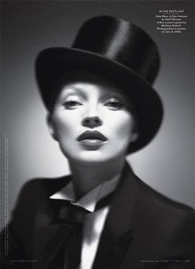
Homme Girl

Kate MossMarlene Bette Davis

Katherine Hepburn
Tilda

He Said She Said: Bacon

“I had rather be shut up in a very modest cottage with my books, my family and a few old friends, dining on simple bacon, and letting the world roll on as it liked, than to occupy the most splendid post, which any human power can give.” -Thomas Jefferson

Faye

Ms Wong in fall winter Celine.

19 September 2010

Happy Birthday Carine!

Mommy Roitfeld is 56!

As Grace Jones

The latest Numero Homme: A man as a woman dresses as a man. The Grace Jones images by Jean Paul Goude are endlessly recycled.